|
typeworkshop.com home : type-basics : references : archive |
mailing list |

| type basics |
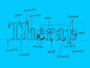
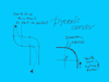
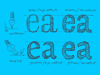
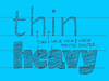
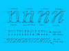
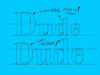
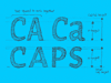
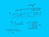
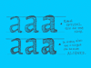
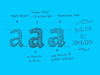
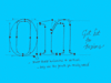
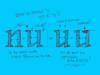
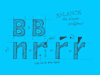
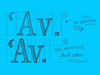
100% practical. Sketches have been made to explain some basic issues in type design during the workshops. They get used to point out some problems which raise while creating a new typeface. Only some foundations are shown, no deep sophisticated details.
Any suggestions? Let us know.
[Type-basics in hungarian] : [Type-basics in spanish] : [Type-basics in german]


 background information :
I have a question :
contact : browse :
site-map
background information :
I have a question :
contact : browse :
site-map |