|
typeworkshop.com home : type-basics : references : archive |
mailing list |

| type basics |
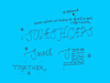
100% practical. Sketches have been made to explain some basic issues in type design during the workshops. They get used to point out some problems which raise while creating a new typeface. Only some foundations are shown, no deep sophisticated details.
Any suggestions? Let us know.
[Type-basics in hungarian] : [Type-basics in spanish] : [Type-basics in german]


 |  picture 19 of 19 |  |
|
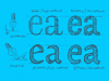
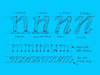
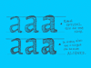
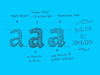
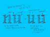
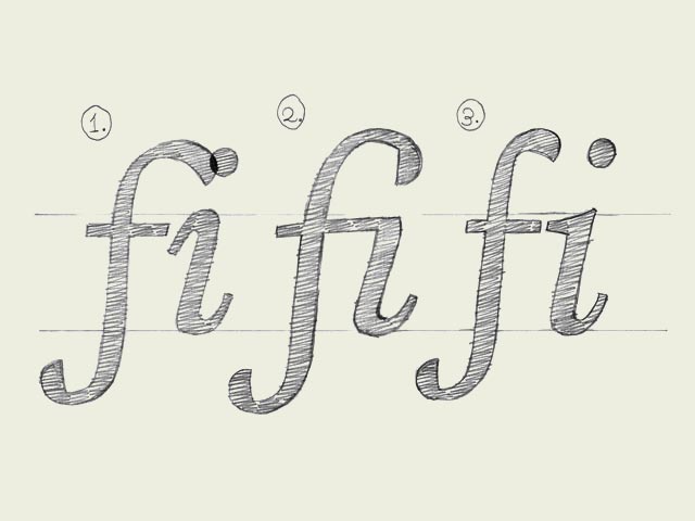
Ligatures.
In a very few cases they are essential. Some well known ligatures are 'fi' and 'fl'. The inevitable need for a ligature is depending on the design of a font. Not every typeface will need a ligature for a 'fi' combination. But in some cases the dot of the 'i' is interfering with the 'f'. Get rid of all that annoying row but making a ligature, one glyph which represents two (or more) characters. Next to a functional aspect, there is an aesthetic aspect of ligatures. You could create a ligature for a 'st' combination, or maybe for 'nky' or 'ism'. Anything is possible. Admitting that also this is not the most urgent issue in type design, it's another obstacle on the road to perfection! | |
 background information :
I have a question :
contact : browse :
site-map
background information :
I have a question :
contact : browse :
site-map |