|
typeworkshop.com home : type-basics : references : archive |
mailing list |

| workshops, Rovaniemi 12 2003, daily |

|
|
|
day 1 : day 2 : day 3 : day 4 final result LED-group : Biggest group : Face-the-light group
Good Point – the shining type
Our aim was to create a type by using concrete lightsources. Matches and LEDs seemed to be smallest available ones. On the other hand we wanted to create a more organic than technical type, so we skipped all those clichee-thoughts of a grid. It was clear that this idea would face some technical problems, but we decided to solve those. Even though this project was made to create shining LEDs, this type can be applied to any other roundish objects.
We wanted to make the result look playfull and happy. Despite of the modern technology and all fancy softwares, there still seems to be a strong feeling of typographic traditions in our Good Point.
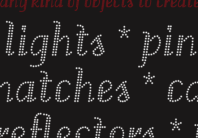 |
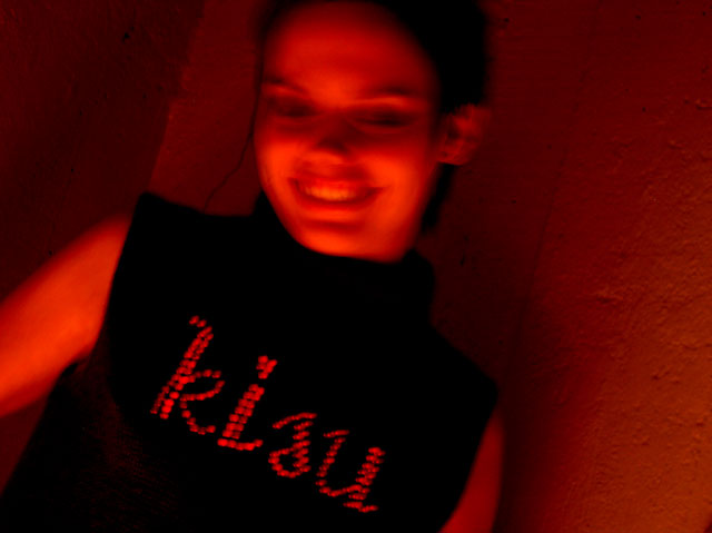
Without darkness there's no light. Darkness forms an excellent contrast for the light. That is also the reason why our group doesn't find darkness a depressive element. The more darkness, the better our LED-typeface Good Point is going to shine! And finally, after five days hard work, it IS shining. And not only in itself: it also spreads the 'shine' and happiness. Or how could you be sad when you see a blinking message on your friends sweater?
ps. Not as shiny as the pictures, but at least the font is shining (from your screen) in this PDF.
 |  picture 6 of 6 |  |
4 comments so far: read comments
 , please do comment
 background information :
I have a question :
contact : browse :
site-map
background information :
I have a question :
contact : browse :
site-map |