|
typeworkshop.com home : type-basics : references : archive |
mailing list |

| workshops, Brussel 02 2005, backgroundinfo |


basic info |
essays & ideas |

We asked different creatives to give a contribution about:
Car lettering as a visual chance, in and on a personal public space.
Please click on the pictures to read & react (send us you contribution, here).

 Peter Bünnagel, designer Scrollan, Berlin, Germany |
 Prof. Czyk (aka Alexander Branczyk) Xplicit, Berlin, Germany |
 Piet Schreuders, art director eg. Poezenkrant, Amsterdam, NL |
 Christian Schwartz, type designer Orange Italic, New York, USA |
 Sasker Scheerder, artist his website, Rotterdam, NL |
 Michael Göke, 3d designer and rockstar Cryptic flowers, Essen, Germany |
 Eike, designer Subfuse, Berlin, Germany |
 Henrik Birkvig, designer and head of the D.G.H. · LetterLab, Denmark |
 DJ Wout, designer, AGI member & DJ FdV, Rijswijk, Den Haag, NL |

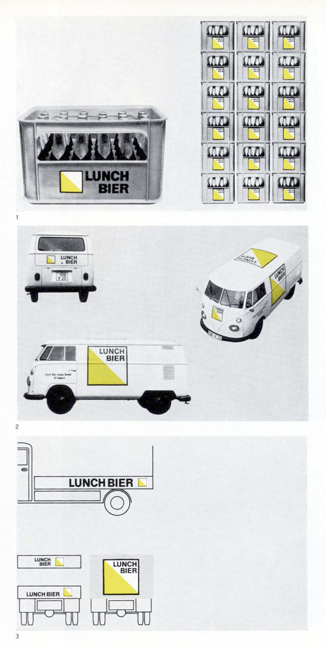
Lunch-Bier logo by Anton Stankowski. Applied on a VW-van.
I allways found this a very intriging design, especially because one doesn't associate this logo with beer. It is so minimal and it was so modern at the time!
But now it looks like it is designed for the cheapest supermarket-house-brand-beer...
Another reason why I like it is that it is shown here on this very cute VW-van. Check out the lettering on the roof of the car. That was also very revolutionary at the time...
alles im grünen Bereich, euer DJ Wout


0 comments so far: read comments
 , please do comment

 background information :
I have a question :
contact : browse :
site-map
 |
