|
typeworkshop.com home : type-basics : references : archive |
mailing list |

| workshops, Brussel 02 2005, backgroundinfo |

basic info |
essays & ideas |

We asked different creatives to give a contribution about:
Car lettering as a visual chance, in and on a personal public space.
Please click on the pictures to read & react (send us you contribution, here).
 Peter Bünnagel, designer Scrollan, Berlin, Germany |
 Prof. Czyk (aka Alexander Branczyk) Xplicit, Berlin, Germany |
 Piet Schreuders, art director eg. Poezenkrant, Amsterdam, NL |
 Christian Schwartz, type designer Orange Italic, New York, USA |
 Sasker Scheerder, artist his website, Rotterdam, NL |
 Michael Göke, 3d designer and rockstar Cryptic flowers, Essen, Germany |
 Eike, designer Subfuse, Berlin, Germany |
 Henrik Birkvig, designer and head of the D.G.H. · LetterLab, Denmark |
 DJ Wout, designer, AGI member & DJ FdV, Rijswijk, Den Haag, NL |
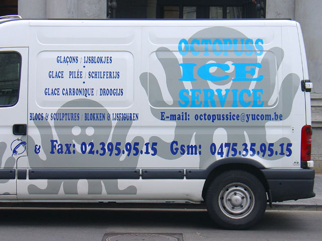
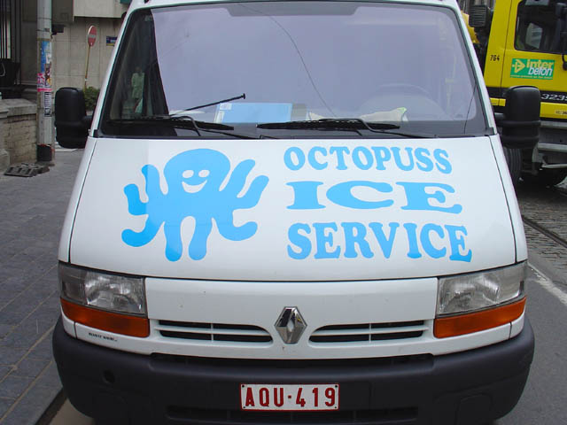
I photographed the Octopuss van in Brussels last year, in Koningslaan, near the Botanique. There are several things wrong with it but it has a definite charm. The way the Cooper Black has been compressed beyond recognition would stop any passing typophile dead in his tracks. The BLOKKEN & IJSFIGUREN words, for instance, were scaled horizontally to about a third. Yet the happy octopus logo and the many intriguing bilingual product names (glace carbonique/droogijs) would bring a smile to anybody's face. Let's all send a message to octopussice@yucom.be and tell them how much we appreciate the designer's effort.
This builders' van could be spotted on Keizersgracht, Amsterdam. The lettering isn't great but it's the logo that wins us over. Three bold colors, a simple, clear and straightforward image -- what more do we want? I would definitely trust my piping and renovating work to these professionals.
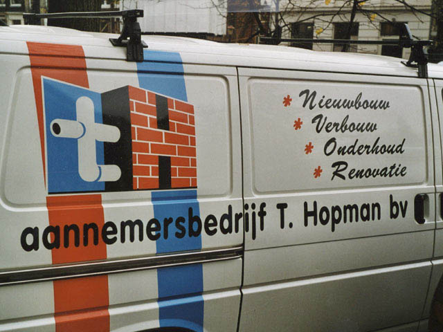
Piet Schreuders
Sorry Akiem en Bas, dit kostte mij 40 minuten, dus het achtvoudige van de door u geraamde tijdsspanne!
0 comments so far: read comments
 , please do comment
 background information :
I have a question :
contact : browse :
site-map
background information :
I have a question :
contact : browse :
site-map |