|
typeworkshop.com home : type-basics : references : archive |
mailing list |

| workshops, Brussel 02 2005, backgroundinfo |

basic info |
essays & ideas |

We asked different creatives to give a contribution about:
Car lettering as a visual chance, in and on a personal public space.
Please click on the pictures to read & react (send us you contribution, here).
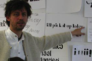
 Peter Bünnagel, designer Scrollan, Berlin, Germany |
 Prof. Czyk (aka Alexander Branczyk) Xplicit, Berlin, Germany |
 Piet Schreuders, art director eg. Poezenkrant, Amsterdam, NL |
 Christian Schwartz, type designer Orange Italic, New York, USA |
 Sasker Scheerder, artist his website, Rotterdam, NL |
 Michael Göke, 3d designer and rockstar Cryptic flowers, Essen, Germany |
 Eike, designer Subfuse, Berlin, Germany |
 Henrik Birkvig, designer and head of the D.G.H. · LetterLab, Denmark |
 DJ Wout, designer, AGI member & DJ FdV, Rijswijk, Den Haag, NL |
01 Why is it so easy to fuck up a car with wrong car lettering? Cars are also design objects, with lines, forms, the whole shebang. Very often they just put the shit on without even looking at the car. Not even checking if it supports the design of the car at all. The same goes for colors unless mobile rainbows are the bomb these days. Ask yourself, how often have you seen a car with lettering you liked? And how often have you recognized the car or the car color?
02 Car lettering is often only readable from one point of view. And weird enough it's only readable if the object doesn't move or you and both the object move. The whole function of a car is about moving and so should be it's lettering. Also why can't i read or see stuff from any slanted point of view. Lettering is always on the sides, like it's a box. Top, left, right, front and back. The car is 3D why isn't the lettering 3D? It's not a magazine you know.
03 Is it possible to design a car lettering in such way that it still is readable at high speed, without moving your head? Do you need a certain kind of typography that takes care of this problem perhaps by having a contra movement?
04 It's interesting to see the difference between for instance F1 and Nascar car lettering and your daily dose of car lettering on the street. Not that the car racing lettering is all that but they try harder and especially within the american scene created their own style. At least with some sort of respect towards the car.
Sorry, but I have to move on, respect from Berlin, Eike
1 comments so far: read comments
 , please do comment
 background information :
I have a question :
contact : browse :
site-map
background information :
I have a question :
contact : browse :
site-map |