|
typeworkshop.com home : type-basics : references : archive |
mailing list |

| workshops, Brussel 02 2005, backgroundinfo2 |


basic info |
essays & ideas |

We asked different creatives to give a contribution about:
Car lettering as a visual chance, in and on a personal public space.
Please click on the pictures to read & react (send us you contribution, here).

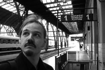 Ralf Herrmann, designer Typografie.info, Weimar, Germany |
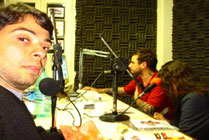 Fabio Bola, designer and musician Bala, Brasil |
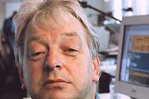 Prof. Paul Mijksenaar, president of Bureau Mijksenaar, Amsterdam, NL |
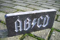 Andy Clymer, type in media student T+M, andyclymer.com, Den Haag, NL |
 Karin Liefting, journalist working for the Volkskrant, Den Haag, NL |
 gerlach en koop, artists gebr-genk, Den Haag, NL |
 Donald Beekamn, designer & radio DJ DBXL, Amsterdam, NL |
 Armin Vit, designer & writer Speak Up, Brooklyn, NY, USA |

Hey drivers & designer,
here my carlettering contribution:
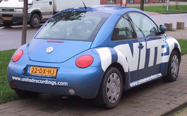
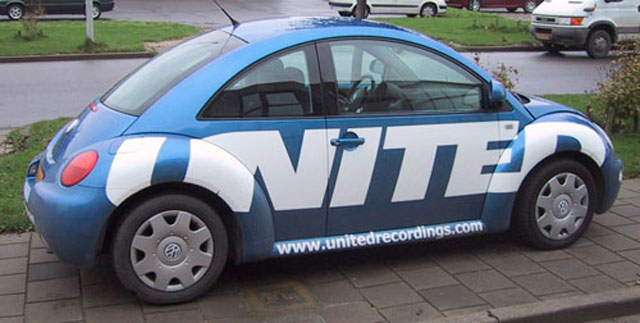
The new Beetle by VW is not the most convenient car for lettering, cause of the overall round shapes.
the company that did this stickering supposedly had 3D-computer models of most brands of cars. also the new beetle was in their archive.
i wanted the UNITED lettering to be all over, front to back, so that seemed easy.
nonetheless they had to cut up the stickers many times to make a perfect fit.
grz, donald [DBXL]



0 comments so far: read comments
 , please do comment

 background information :
I have a question :
contact : browse :
site-map
 |
