|
typeworkshop.com home : type-basics : references : archive |
mailing list |

| workshops, Brussel 02 2005, backgroundinfo2 |
basic info |
essays & ideas |

We asked different creatives to give a contribution about:
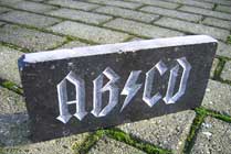
Car lettering as a visual chance, in and on a personal public space.
Please click on the pictures to read & react (send us you contribution, here).
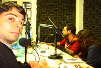
 Ralf Herrmann, designer Typografie.info, Weimar, Germany |
 Fabio Bola, designer and musician Bala, Brasil |
 Prof. Paul Mijksenaar, president of Bureau Mijksenaar, Amsterdam, NL |
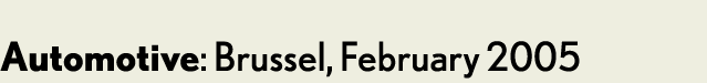
 Andy Clymer, type in media student T+M, andyclymer.com, Den Haag, NL |
 Karin Liefting, journalist working for the Volkskrant, Den Haag, NL |
 gerlach en koop, artists gebr-genk, Den Haag, NL |
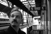
 Donald Beekamn, designer & radio DJ DBXL, Amsterdam, NL |
 Armin Vit, designer & writer Speak Up, Brooklyn, NY, USA |
Pollution: one of the worst problems of our planet.
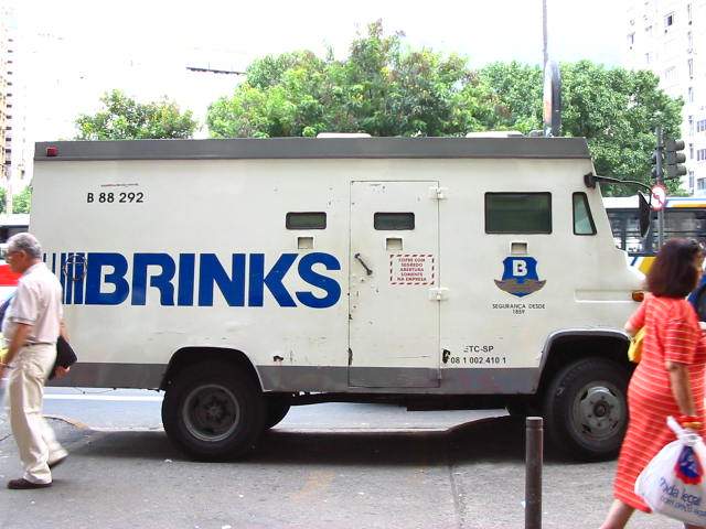
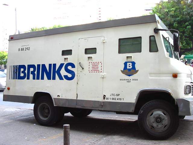
Brinks Security Company in Brasil carries values in armored vehicles that generally are not regulated, go up in the sidewalk occupying pedrestrians' crossing and release a black smoke from the discharge pipe.
People shall avoid these vehicles, detouring when possible, crossing to the other side of the street, walking in the street with the cars, covering the nose or using a protective mask.
The company's logotype begins in sequences of vertical lines heavier each time, suggesting speed. Beyond speed in taking care of its customers, the company should have a little more care and respect to people, using better cars without harming the environment.
The Logotype is composed with letters similar in terms of height to Franklin Gothic #2 Roman (Lynotype version), however with some differences, as:
- the leg of the "R" is curved, as in the Helvetica (Linotype version: Neue Helvetica 65 Medium);
- the endings of the "S" are flat as in the Univers (Linotype version: Univers 65 Bold);
- the leg and the arm of the "K" meet at one junction in the stem, as in the Univers (Linotype version: Univers 65 Bold);
- the bars of the "B" and the "R" do not reach the stem.
0 comments so far: read comments
 , please do comment
 background information :
I have a question :
contact : browse :
site-map
background information :
I have a question :
contact : browse :
site-map |