|
typeworkshop.com home : type-basics : references : archive |
mailing list |

| workshops, Brussel 02 2005, backgroundinfo2 |

basic info |
essays & ideas |

We asked different creatives to give a contribution about:
Car lettering as a visual chance, in and on a personal public space.
Please click on the pictures to read & react (send us you contribution, here).
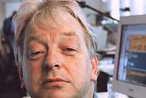
 Ralf Herrmann, designer Typografie.info, Weimar, Germany |
 Fabio Bola, designer and musician Bala, Brasil |
 Prof. Paul Mijksenaar, president of Bureau Mijksenaar, Amsterdam, NL |
 Andy Clymer, type in media student T+M, andyclymer.com, Den Haag, NL |
 Karin Liefting, journalist working for the Volkskrant, Den Haag, NL |
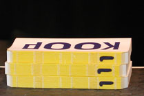 gerlach en koop, artists gebr-genk, Den Haag, NL |
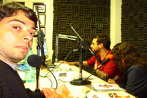
 Donald Beekamn, designer & radio DJ DBXL, Amsterdam, NL |
 Armin Vit, designer & writer Speak Up, Brooklyn, NY, USA |
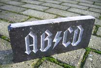
I always wondered why lettering on the front of cars is always flipped horizontally. On an emergency vehicle this makes sense, but not for advertising! There is always only one person driving in front, who can read the text in the rear mirror. But all drivers and pedestrians passing by can't read anything.
So when doing a car lettering you always have to keep in mind, how your text will be read. Most car lettering will not be read at full speed. (Only we designers risk an accident by overtaking trucks and guessing the typeface of the logotypes.)
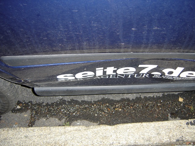
Attention by difference:
Since someone crashed in my car, my little advertising gets a lot more attention at every stopping at a traffic light.
Most car lettering is read when the car is parked in the city or is passing by in slow traffic. So size and readability are not always the most important things - but the amount of text that is used! Most companies put their complete letterhead texts on a car, but of course, no one can keep all these phone and fax numbers in mind. Car lettering should rather considered as something that is 'recognised' rather than read. So forms and information should be as simple and clear as possible.
0 comments so far: read comments
 , please do comment
 background information :
I have a question :
contact : browse :
site-map
background information :
I have a question :
contact : browse :
site-map |